Logos play a vital role in branding. The use of a symbol or other visual element can create an instant association with a brand. If you are unsure about the effect of logos on consumer behavior, I will share with you that my children recognized logos of brands like McDonald’s UPS, and Disney before they could read those names. Another characteristic about logos is that they matter to people when the brand matters to them. Perhaps the most notable “revolt” against a new logo in recent years happened in 2010 when retailer Gap unveiled an updated logo. The outcry from customers and brand fans was so swift and intense that the new logo was abandoned in a matter of days and the original logo returned to its rightful place as brand icon.
The $46K Logo
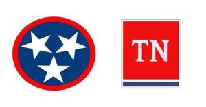
The latest logo flap occurred in Nashville as the State of Tennessee announced a new logo would be used as a brand identity piece for the state and its 23 departments. The logo, developed by Nashville agency GS&F, took nine months to develop at a cost of $46,000. In the photo below, the old logo is on the left and the new logo is on the right.
The old logo features three stars inside a circle, taken from the Tennessee state flag. with the stars representing the three “grand divisions” of the state- East Tennessee, Middle Tennessee, and West Tennessee. The new logo represents… well that’s a good question. Public reaction has been largely negative, both for the appearance of the design and the price tag on it. GS&F’s managing vigorously defended the design, touting its simplicity and that “design is always a subjective matter.” Questions about the process and cost aside, the question that is worth is asking is whether Tennessee even needed a new logo.
What a Logo Should Do
To answer the question of whether Tennessee needed a new logo, consider how the existing Tennessee logo stacks up for the following four questions:
- Is it distinctive? In short, yes.
- Is it relevant? The three-star logo has significant meaning about the state.
- Is it versatile? A logo needs to look attractive across a variety of media- print, broadcast, web, outdoor- the three-star logo seems to pass the test for all media.
- Is it enduring? The distinctiveness, relevance, and versatility of the three-star logo serve as evidence that the answer to this question is yes, too.
The three-star logo meets all criteria for an effective logo. The new logo? It seems challenged to meet the criteria of distinctive and relevant. Its design had versatility in mind, and its simplicity aids its chances of being an enduring brand symbol. However, in the end it seems that the old logo is still effective and had not run its course.
When a New Logo is Needed
A fine line exists between maintaining status quo and sticking with what works. It is good brand stewardship to evaluate the effectiveness of brand identity elements such as a logo to ensure they are working to build a strong identity. Some situations in which a new logo is a viable option include:
- Change in ownership
- Repositioning a brand
- Making a fresh start following troubles or controversy
- Tweaking fonts, geometric shapes, or other imagery for a fresh, updated look
A Familiar Lesson
I have written about this scenario several times in eight years of blogging. Each time the takeaway for me is a reminder that while an organization owns brand assets such as name, logo, and brand marks, the meaning and sentiment attached to them reside with customers or in this case, the citizens of Tennessee. One reason why so many people were upset with the new logo is that it was a replacement for their logo. Nearly 24,000 people have signed a petition at Change.org asking Governor Bill Haslam not to change the logo.
A business need drove the design of a new logo. State department and agencies are brands in their own right, thus creating a large portfolio of brands under the State of Tennessee umbrella. The new logo is intended to bring unity to the brands in the Tennessee family. However, such a unifying logo already existed and could have been used for the same purpose.

